Categories
Art Design People Restaurants

Keith Goddard Chef + Munch Food Company London

Bringing Home The Bacon 

On a return visit to the Violin Factory at Waterloo for the launch of Grohe’s new Blue classy collection of taps, we caught up with London’s hottest Michelin starred chef Keith Goddard. Classically trained – he studied at the French Culinary Institute in New York – 33 year old domestic god Keith has worked with Tom Aikens and Oliver Peyton at the Wallace Collection. After his much lauded stint at the restaurant 101 Pimlico Road, Keith’s latest venture is Munch Food Company.

“If you want fine dining experience in the comfort of your home or for your business event, Munch is the answer,” says Keith. “We love the challenge of creating exquisite one-off menus. We’ll happily do it in your kitchen or at your chosen venue. Either is good for us. Just tell us how many people we’re catering for, what your tastes are, and we’ll come up with something that’s fit for a king.” Or queen.

Working up a sweat in the Violin Factory kitchen, Keith reveals, “Equally if all you’re after is a platter of sandwiches or Munch pizzas followed by homemade brownies, banana and maple syrup flapjacks, and elderflower refreshers to show your employees how much you appreciate their hard work, then order a Friday afternoon treat they won’t forget!” There’s always room to Grohe.

Why a chef? “I became a chef by accident while training in New York at the French Culinary Institute. My intention was to learn all I could about every aspect of the restaurant business before embarking on a career that would hopefully have led me to become a successful hotelier or restaurateur. Although I absolutely loved cooking even then, the idea of spending 16 hour days in a hot kitchen didn’t appeal to me. However, one week into my Culinary Arts Degree I realised I’d found my vocation.” Where’s home? “Paddington in London with my girlfriend.”

Why Munch? “At the time when 101 Pimlico Road shut its doors I’d spent six straight years in restaurant environments doing anything up to 100 hour weeks. I certainly didn’t want to change industry but had a plan in my head as to where I wanted to be in my mid 30s. This involved not only a restaurant of my own but a catering division that would allow us to provide a service for many of my customers who’d inquired about it in the past but to whom I had to say no to as we just didn’t have the capacity. On top of that, event catering is a very different skill. I figured the time was right to make the move into it before I got back into another restaurant.”

Favourite dish to cook? “Strangely I love cooking soups, particularly authentic soups from various parts of the world. In a similar vein I like slow cooking things like daubes, stews and tougher cuts of meat.” Best advice? “Don’t mess with the classics!”

Eating out? “I like to vary things to be honest. We’re extremely lucky in London as in one week we could eat pretty much every cuisine in the world. I occasionally like to go high end to Michelin star restaurants but the rest of the time to anywhere that has identity, that isn’t trying to please everyone. Other than French and Italian, I like Lebanese, Chinese, Japanese and Indian food a lot.” London or New York? “I lived in New York for two of the best years of my life. However London is tough to beat.”

Categories
Art Design Luxury

Masterpiece London Preview 2013 + Royal Hospital Chelsea London

Art Attack

Donald Judd. Art for architecture’s sake. A private view at the chic David Zwirner Gallery in Mayfair. Three floors of white galleries behind a cream façade. Cool as. Next the RCA end of year show at the Dyson Building in Battersea. The gallery with a shop in residence. Unresolved duality. Is it just us or does art exist in a vacuum these days? Charles Saatchi put in an appearance, no doubt hunting for the next Damien or Tracey. Back over Battersea Bridge, a wedding cake cast in iron, walk down Cheyne and check into hospital. Royal Hospital Chelsea. We’ve saved the best till last. It’s Masterpiece, the highest end arts and antiques fair in London reserved for the nought-point-one-per-centers. Boutique Maastricht.

A red carpet over green grass leads to a white pop up portico framing the entrance to a vast marquee, a primitive structure lifted to the sublime by a printed cloak resembling the hospital building: Henry James’ “principle of indefinite horizontal extensions” in canvas. Masterpiece attracts the famous and infamous. Princesses Eugenie and Beatrice walk on by. Anna Wintour’s sharp bob and Zandra Rhodes’ fuschia bob make them both recognisable from behind, surely the key definition of fame. We are joined by leading architect and avatar of heritage today John O’Connell, first director of the Irish Architectural Archive Nick Sheaff, and reductivist artist Suresh Dutt. What’s the collective noun for design luminaries? Coterie?

Now in its fourth year, Masterpiece is a variegated container of uses, architecture, history and technologies, challenging our thinking on design, strategies and the relevance of art – and on the urban importance of aesthetics. It questions artistic predilections and speculates on ideas of time and context. A temporary setting for the permanently magical. First pitstop the Ruinart stand, the oldest Champagne house, purveyor to the likes of Browns Hotel. Next stop, The Mount Street Deli for beetroot and avocado salad.

The new Maserati Quattroporte on display provides a beautiful distraction. “The design of the Quattroporte is inspired by Maserati’s core stylistic principles: harmony of proportions, dynamic lines and Italian elegance,” explains Marco Tencone, head of the Maserati Design Centre. “It’s been kept simple and clear with a character line flowing alongthe side to define the strong volume of the rear wing, creating a very muscular look. The cabin is sleek with a three window treatment and frameless doors.” Even the engine is a work of art. Next, we call in on Philip Mould who has just sold The Cholmendeley Hilliard miniature, a rare portrait of an unknown lady of the Tudor court, for a not-so-miniature £200,000.

A pair of George III marquetry semi elliptical commodes with Irish provenance is the star attraction at Mallett, that stalwart of Dover Street antiques hub. “All this is very emphatic,” notes John, pointing to the lashings of evidently bespoke detail. Mallett attributes the commodes to the London cabinetmakers Ince & Mayhew. They were supplied to Robert and Catherine Birch in the 1770s for their home near Dublin, Turvey House. Duality resolved. John reminisces, “I picked up fragments of historic wallpaper from the derelict Turvey House, just before it was demolished in 1987.”

Onwards to the Milanese gallery Carlo Orsi which is celebrating winning object of the year, a 1920s bronze cast by Adolfus Wildt. But we are there to see Interior of Palazzo Lucchesi Palli di Campofranco in Palermo, an exquisite oil on canvas. Elegant Roman gallerist Alessandra di Castro remarks, “Oil is much more sought after than watercolour. This important aristocratic residence was the townhouse of the Duchess of Berry.” She understands the painting to be by the early 19th century Neapolitan artist Vincenzo Abbati. “It’s a wow picture!”

“The layered curtains filter the light through the open windows, imparting a soft indirect radiance to the room,” observes John. “The red banquette type seating, white chimney board and green painted frieze combine to form a most stylish Sicilian neoclassical interior. It forms the setting for a beautifully hung significant collection of paintings.” Guercino, Stomer, Titan: all the greats are represented. “My life is crowded with incident. I’m off to a bidet party in Dresden.” In between, he’s restoring Marino Casino, Ireland’s finest neoclassical building.

Categories
Art Design People Restaurants

Lady Lucy French + St James Theatre Westminster London

A Class Act

Lady Lucy French copyright Stuart Blakley

Lavender’s Blue catch up with Lady Lucy French, Director of Development at London’s first and only 21st century theatre. Take two. The scene is coffee in the theatre’s ground floor brasserie. Walls of windows capture lively visual interaction with the streetscape, heightened by the dado level pavement. The world is a stage.

French Park Roscommon copyright Stuart Blakley

First, a little introduction. Lady Lucy French is the great granddaughter of the 1st Earl of Ypres, Commander in Chief on the Western Front in the 1st World War and Lord Lieutenant of Ireland. Sir John’s grandson, the 3rd and last Earl, had three daughters from his first marriage and one from his second. He died in 1988. Lucy is his youngest daughter. The 1st Earl’s elder sister was the suffragette and writer Charlotte Despard. A founding member of the Irish Women’s Franchise League and the Women’s Prisoners’ Defence League to support Republican prisoners, she didn’t quite see eye to eye politically with her brother.

French Park Roscommon

“One day, Charlotte was leading a suffragettes march down O’Connell Street in Dublin,” relates Lucy, “when she met a brigade led by her brother.” Awkward. “Neither of them was quite sure what to do. By rights the Lord Lieutenant should have arrested the protestors!” Instead, they each moved to the side and continued marching in opposite directions.” Literally and metaphorically.

French Park in Roscommon was the Italian inspired French family’s Irish seat designed by the German born architect Richard Castle. Like Russborough, French Park was Castle’s 18th century take on Palladio with curvy colonnades attaching wings to a colossal main house. Drama set in stone. It was the seat of the Barons de Freyne before it was demolished in the 20th century. Charlotte Despard spent a lot of time at French Park where she was born. The current Lord de Freyne, Lucy’s cousin Charles, lives in Putney. “Hampstead and St John’s Wood are my neck of the woods. A few years back I visited Roscommon,” recalls Lucy, “but couldn’t find the house. Some of the locals pointed it out. It’s a pile of rubble now.”

Back to St James Theatre. “I got involved over 18 months ago when it was just a building site,” she explains. The location is an enclave of to-die-for Georgian houses opposite Buckingham Palace. “After the previous theatre burnt down, Westminster Council had a clear vision for the site. The Council granted permission for 35 flats but insisted on a replacement theatre as well. It’s been an exciting journey for the team.” Lucy works alongside creative director Robert Mackintosh, executive artistic director David Gilmore, executive theatre director Guy Kitchenn and James Albrecht, studio director.

“It doesn’t look like a stereotypical theatre, does it?” muses Lucy, gazing towards the contemporary open plan ground floor reception and sweep of marble staircase. “St James is multifunctional. You can come here for coffee downstairs and fine dining upstairs. There are some great Italian signature dishes and a varied series of seasonal menus. Oh and never mind The Goring, we do afternoon tea here too! You can come see a show or play in the main house. And there’s comedy and cabaret in the studio.”

Lucy began her career in Liverpool, “a great city”, working in journalism and gradually moving into arts fund raising. It was the time when Liverpool was gearing up to be European Capital of Culture. She has since swapped the skyline of cranes over the northern city for that of Victoria. Lucy sits on the board of Victoria Business Improvement District. On her return to London, the theatre called. A five year stint as head of development at Hampstead Theatre was followed by the same post at Regent’s Park Open Air Theatre. All good grounding for her latest role.

St James Theatre is privately funded which gives us tremendous freedom,” Lucy confirms, “We’re self funding. With all the arts cuts and changes to arts funding, art and business are increasingly intertwined. I believe we’re at the forefront of this approach. We’ve secured a five year deal with Create Victoria which is fronted by Land Securities. We’ve got a lot of local support as well.”

The joy of building anew means there isn’t a bad seat in the house. No awkward pillars – actually make that no pillars at all – in this theatre thanks. Just a shallow curve of seats descending to the stage below in ever decreasing arcs. Comfort is key in the quietly decorated interior. Drama is saved for the stage. “It’s a highly successful theatre for actors and the audience alike,” Lucy observes. “It’s got terrific acoustics – pitch perfect for classical concerts!”

“So far we’ve hosted five plays, all wonderfully different, from Sandi Toksvig’s Bully Boy to Jean Webster’s Daddy Long Legs. In our first six months we even received an Olivier nomination.” A huge show is planned for next year. Lucy reveals a series of spoilers will be released in the run up to a September announcement. Next year’s a big year for her family history too. She’s planning a large scale event in honour of her great grandfather to mark the centenary of the outbreak of the 1st World War. Australia House on the Strand is the venue. Sir John French attended its opening in 1918.

St James Theatre 1 copyright lvbmag.com

Lucy herself cuts quite a dash, complementing her innate prettiness with millinery zeal. Her theatrical headpieces have become something of a fixture at premieres. When the theatre’s staircase, designed by Mark Humphrey, was unveiled, she wore – what else? – a maquette of the staircase. To scale, of course. “I used to make a lot of my hats,” she says. “Recently I’ve been trying something a bit different – a collaboration with a local florist. Orchids are great – they last all evening without drooping.” Her most extraordinary hat to date was a three foot sofa atop an extravagance of ostrich feathers. She wore it to the Royal Enclosure at Ascot. “It was properly upholstered by a Liverpudlian furniture maker.” Was it not a little heavy? “Darling, by mid afternoon I’d got used to it.” And with that, Lady Lucy French leaves the building.St James Theatre 2 copyright lvbmag.com

Categories
Art

David Plaksin + Erarta Galleries Mayfair London

He Has Form

Around Berkeley Square is a little piece of Londongrad. Evgeny Lebedev, owner of the Evening Standard, has an office off the square on Hill Street. Waterstone’s, with its five storey flagship store on nearby Piccadilly (check out that view from the fifth floor bar!), is owned by Boris Yeltsin’s friend Alexander Mamut. Also on Piccadilly is the Russian food shop and café Caviar House & Prunier. Oligarch and restaurateur Arkady Novikov’s eponymous brasserie is on Berkeley Street. Opposite Novikov is London’s finest contemporary Russian art gallery Erarta. With a penchant for private views, Lavender’s Blue report from Erarta’s latest show.

Structure by David Plaksin celebrates the artist’s fascination with graphic design and photography. A new body of work, it also represents his artistic sensitivity toward visual objects with strong associative potential. Plaksin graduated from the prestigious Serov Leningrad Art College in 1957 and from 1975 onwards he was part of the Leningrad Gorkoma artistic movement. In 1980 he became an active member of the Union of Russian Artists which allowed him to join the National Federation of Artists a decade later. Despite his membership of various groups, David Plaksin does not align himself with any one group of St Petersburg artists. His atypical experimentation with various painting media allows for a constant rebirth of form and content over the course of his long career.

In addition to his ongoing engagement with oil and tempura, during the Soviet era, David Plaksin worked as a book designer and illustrator. He drew typography by hand, cutting and gluing shapes together to create graphic compositions. The material quality of language continues to interest the 77 year old artist. Language for him is aural, oral, cultural, visual, literal and metaphorical. It’s part of socio political history. Letters can be objects just as words and concepts can be abraded beyond their original meaning. His overriding interest in representation, semblance, transformation and ultimately meaning has led him to fuse form and subject. In Structure, calligraphy is magnified to architecture and architecture is reduced to pattern. His ten monochromatic and five polychromatic digital prints onto aluminium line the walls of Erarta.

A 20 piece artwork called Sankt-Petro-Lenin-Burg spells out the hyphenated history of St Petersburg, formerly known as Leningrad and prior to that, Petrograd, before returning to its original name in 1991. The names and evocations of the city are used to depict both urban and national identity. The Communist buildings which form the basis of Plaksin’s Architecture series were built to represent strength and power. But he breaks them apart. Brutalist, Constructivist and Stalinist buildings take on a decorative role. The lattice-like framework of built form is raised, rotated, made transparent and overlaid. Approximations of letterforms appear, their apparent alphabetic simplicity belying ever intensifying depth of meaning.

Erarta’s flagship, the Museum of Contemporary Russian Art, is housed in a late Stalinist classical building of palatial proportions in St Petersburg. Buildings, like letters, tell stories. This one says Soviet era in its rustication and rows of columns but above the parapet electric red lettering proclaims ERATA. A new era, a new use, a new name. Indoors, simple white walls and lighting allow the art to speak without interruption. The Erarta Museum is the largest private museum of contemporary art in Russia, exhibiting over 2,000 works by 150 artists across five floors. Erarta Galleries, already established in London, New York, Zürich and St Petersburg, are opening in Hong Kong in 2013.

Categories
Architecture Art People

Suresh Dutt + Canary Wharf London

2D or not 2D

OLYMPUS DIGITAL CAMERA

Artist Suresh Dutt’s conceptual framework integrates drawing with sculpture. A translation of the two dimensional onto multiple three dimensional planes, so to speak. He applies and deconstructs geometric forms and grid structures into space and onto surfaces. Immersive sculptures are devised that explode into an unknown yet certain dimension.

DCB 1


Suresh prescribes a pragmatic approach to his creative endeavours. He provides efficient solutions which resolve the relationship between two and three dimensions. This analysis reaches a fait accompli – in the present – with his recent major work. Winning the First@108 Public Award in 2011 enabled Suresh to create a sculpture outside the conventional confines of a white cube gallery space. The stereotypical artistic context with its three dimensional limitations is replaced by an exposed public space and all its embroiled complexities. To add a further layer to this contextual complexity, the sculpture was commissioned to inhabit two urban, but very distinct, built environments. The first (temporary) setting was in front of an Edwardian villa on Old Brompton Road, South Kensington. The second (permanent) setting is Montgomery Square in Canary Wharf.2 Suresh Dutt copyright lvbmag.comAn ornate red brick traditional enclosed backdrop in West London; a geometric mirrored contemporary exposed backdrop in East London. Suresh’s chromatic response is ingeniously simple. Paint it blue. An apparent simplicity of form – line drawn, no less (no more) – belies the intensity of his thought process. An hypothesis is presented to the viewer. He explains,


10. Suresh Dutt copyright lvbmag.com“When we view an object in space, we are able to gauge the scale of that object by using visual information surrounding that object and previously learned knowledge. We scale the object in relation to other objects the size of which we already know and comprehend. This information and understanding is essential when we draw a three dimensional object or convert an object into an image.”


Suresh contemplates that the visual effect of foreshortening can be used to create the illusion of depth on a two dimensional surface. This allows the drawing of the object to retain the same scale as the actual three dimensional object. He enthuses, “I wanted to construct a physical representation of foreshortening in three dimensional space through the drawing of a cube. The cube is the most easily perceived and recognised geometric structure.”

This desire stems from a concern about the way a person’s perception can be altered. An unorthodox paradox emerges. A parallel lined world arises. The starting point for him is something that is universally understood. Immersed in art theory, Suresh applies anamorphosis, the principle method of manipulating perspective. Anamorphosis is a distorted projection or perspective which requires the viewer to use special devices or to occupy a specific vantage point to reconstitute an image. Lines and shapes create an alternating perspective. It becomes impossible to retain the two and three dimensional aspects together in one view.


6 Suresh Dutt copyright lvbmag.comSuresh manipulates spatial perception to great effect in this sculpture. The viewer is left disorientated in self made illusions. It exclaims, “We know nothing about space!” Euclidian geometry and the assumption of space are questioned. Even the tense of the sculpture’s name, Drawing Cube Blue, exudes uncertainty in the dimension of time.


7 Suresh Dutt copyroght lvbmag.comAn equally brilliant and academic accompanying solo exhibition in the Salon Gallery of Dora House explores light and perception through reflection. Suresh’s ongoing fascination with the structure of the cube inspires the creation of objects of unsettling ambiguity. Visible yet invisible, physical but intangible, they exist where volume and surface collide. His work will soon occupy a third type of space. Frenetic urbanity superseded by bucolic countryside, brownfield to greenfield, further afield a leftfield variation of Drawing Cube Blue will form part of a country house estate collection. Watch this space. Although Suresh may make us question if it is a space. Or even his field.8 Suresh Dutt copyright lvbmag.com

Categories
Architecture Art Design Developers Fashion

Ballymore + Embassy Gardens Marketing Suite Nine Elms London

Brand New 

1 Embassy Gardens copyright lvbmag.com

Unless you’re experiencing a news blackout or enjoying an extended break on Vamizi Island, you’ll no doubt be aware of a rather large reimagining of real estate between Battersea and Vauxhall. Largest in the UK, no less. It’s here that Ballymore Group has launched its stars-and-stripes flagship scheme. Embassy Gardens is bang next door to the US Embassy, heading that way in 2017.

2 Embassy Gardens copyright lvbmag.com

The marketing imagery is mind blowing. This – almost – abandoned stretch of the Thames until now mostly known for dodgy nightclubs will soon be populated by swathes of apartments, a hotel, Linear Park and best of all a brasserie from the guys who brought us Bunga Bunga (sing for your supper). Rebranded Nine Elms on the South Bank, it’s masterplanned by Sir Terry Farrell. He calls it “London’s third city”.

3 Embassy Gardens copyright lvbmag.com

Embassy Gardens is one of the biggest pieces in this regeneration jigsaw. Key player Ballymore will deliver nearly 2,000 homes including “luxury suites” to borrow the sales speak. Founder, Chairman and CEO Sean Mulryan says, “For nearly 30 years, Ballymore has been responsible for some of the best known and most ground breaking developments in London… with Embassy Gardens we have continued to set new standards. We believe that a marketing suite should truly reflect the vision of the neighbourhood. The marketing suite at Embassy Gardens is not only architecturally striking from the exterior but its interior captures the distinctive design and aesthetic of our apartments.”

5 Embassy Gardens copyright lvbmag.comBranding and marketing are more than pictures and conversations. Punters want to experience upfront what it’ll be like to live in a new scheme. Gone with the wind are the days when show flats resembled a Changing Rooms episode stuck in a first phase surrounded by diggers. Well, in London anyway. Embassy Gardens’ marketing suite – or should that be show building? – is a destination in itself. Big names add credit(s) to its kudos. Architecture by Arup Associates. Interiors by Woods Bagot. Gardens by Camlins. Review by Lavender’s Blue.

6 Embassy Gardens copyright lvbmag.comThree sides of an enigmatic opaque glass box hover over the clear glazed walls of the ground floor exhibition space. Translucency and transparency; concealment and legibility. Its august angularity acts as a striking riposte to the zigzagging ziggurats down the river. The box contains two floors of show apartments. Their floorplates are set back from the building envelope to accommodate balconies which project like open drawers into a void over the main entrance. This allows for sectional brochure photographs which otherwise would be entirely impossible to capture.

Woods Bagot has taken branding to a whole new level. Let’s hear from John Nordon, Design Intelligence Leader: “We set out to create beautiful spaces that any architect would be proud of. But it was equally important that the project was a commercial success to our client. To achieve this, we integrated the design process with brand marketing and sales. We want people to be sold on the Embassy Gardens brand first and foremost. The brand values will provide reassurance regardless of the budget and needs of the buyer. This strategy is the norm in the world of consumer goods companies but is new to residential redevelopment.”


He believes with the advent of the wireless era, domestic design technology infrastructure is redundant. Instead Woods Bagot has created space for hardware such as laptops and tablets to blend effortlessly into the interiors. “The aesthetic is inspired by, but does not mimic, classic 1950s American design,” says Jonathan Clarke, Woods Bagot’s Head of Interiors in Europe. “Attention to details such as walnut veneers and ceramic door and drawer handles reinforces the sense of solidity and good taste.” Palm Springs springs to mind. Anyone for Malibu? We do get around a lot but were seriously impressed by these show apartments. Great use of ceramic tiles too: vertically oriented running bond pattern in the bathroom and a wallful in the living area.

7 Embassy Gardens copyright lvbmag.comNot only can the inside of the apartments be experienced before Embassy Gardens is even up to plinth height; so can the view. The third floor of the marketing suite opens from a Philip Johnsonesque pavilion onto a roof terrace. Flowing by, the Thames makes its way from Chelsea Bridge to Vauxhall Bridge. So current. The terrace was the setting for the picnic themed launch of the Linear Park. Ginger beer, baskets of sandwiches and boiled sweets at the ready. Enid Blyton eat your heart out.

9 Embassy Gardens copyright lvbmag.com

Camlins’ meadow garden wraps around the marketing suite, giving a foretaste of what’s to come. Linear Park will incorporate “open green commons as well as enclosed garden squares and majestic tree lined streets” confirms Huw Morgan, Director of Camlins. The contrast with the building is palpable. Control and informality; a great architect and the Great Architect. A marketing suite by default is a meanwhile use. This one should be kept and not just for Christmas. From all at Lavender’s Blue have a good one. And from opera singer Camilla Kerslake.

Camilla Kerslake

Across town, we joined fashionistas Giles Deacon and Jonathan Saunders at King’s Cross Filling Station restaurant. The tenuous editorial link? Vauxhall. A Christmas tree made out of Vauxhall Ampera car parts was unveiled. Moving parts mechanically grooved to a techno beat as fluorescent orange light and frosted air filled the forecourt. Lady Gaga’s erstwhile set designer Gary Card dreamt up the tree. Mince pies, mulled cider and some dancing kept us warm. Sláinte!

Xmas Tree

Categories
Art Hotels Restaurants

Longueville Manor Hotel Jersey + Environmental Art

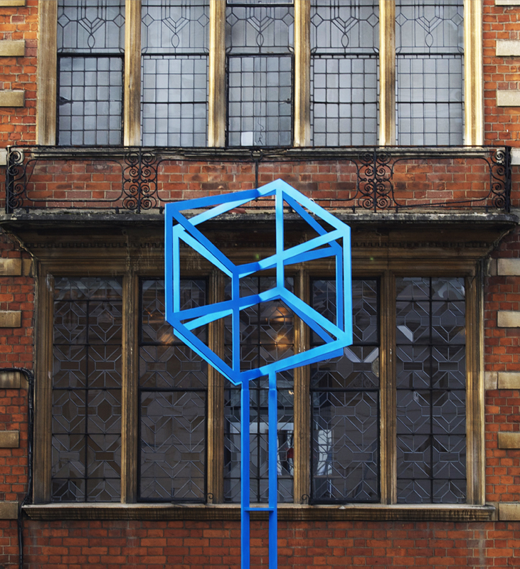
Good for the Environment

1 Longueville Manor Jersey

Like Oedipus, “We saw of old blue skies and summer seas,” while channel hopping for afternoon tea. That unmistakeable five star feel. The familiar sound of crunchy gravel, stepping out of the car (carriage doors, please) to be greeted by the soothing sound of a gently flowing fountain, open entrance doors set in an archway offering a vista beyond of manicured striped lawns, French doors on either side revealing plumped up cushions on well sprung sofas, the scent of camomile candles floating through the air. Where better than the terrace of Longueville Manor in Jersey to enter a discourse on Environmental Art, in an exponential swirl of increments bereft of presumption?

2 Longueville Manor Jersey

Is Environmental art a necessary classification in mid 20th century art? In order to answer this question, it is prudent to distinguish between two ways in which art may be related to the environment. These are approximately conveyed in the traditional antithesis between Classical and Romantic. The Classical artist presumes an established harmony between the forms in art and those in the outside world; the Romantic is aware of a disproportion.

4 Longueville Manor JerseyThis distinction operates in a less precise way between the fields of Kinetic and Pop Art. Both are concerned with sending a special resonance into the environment. Both place great emphasis on the role of the viewer. But they differ in the relationship established between viewer and work. When Robert Dowd included a real apple and an apple painted according to the laws of perspective in the same composition, he was undoubtedly commenting upon the relationship of art to environment. The real apple was an intermediary between the canvas and the world. Sometimes it appears to belong to the environment. Other times, to the implausible shape of the canvas. It becomes a roving ambassador for Robert Rauschenberg’s “gap between art and life”.

5 Longueville Manor JerseyAn analogy is found with the paintings of Jesús Soto. They also depend on the interaction of an illusionistic background and the real objects which hang in front of it. While Robert Dowd depended on a knowledge of pictorial conventions for effect,  Jesús used the disposition of the human retina. Robert succeeds in immobilising the viewer by presenting a combination which distorts the implications of pictorial perspective.  Jesús, though, makes the viewer aware of mobility since it is only by passing in front of his work that its delicate spatial structure can be appreciated. Thus the notion of Environmental Art can be applied to at least two different kinds of work. Firstly, the ‘anxious’ object which illustrates a disproportion between the work of art and the environment. Secondly, and reversing Robert Rauschenberg’s terminology, the ‘secure’ object which serves as a natural extension to the exploration of space. It is a helpful classification in mid 20th century art.

6 Longueville Manor Jersey

It is this second category which presents the widest range of possibilities. The Pop artist worked through existing media of representations since his output almost inevitably depended upon a tension between the object and how it is conveyed. In practice he was confined to isolated works of painting or sculpture. A notable exception to this rule is the work of Claes Oldenburg. His 1970 exhibition at the Ileana Sonnabend Gallery of sculpted ‘meat’ on rows of marble shelves resembled a Parisian butcher’s shop. But Oldenburg was concerned not so much with environment as with context. In his work the act of representation becomes non contextual placement. The plaster cast meat and the plastic typewriter are inherently preposterous because they are so blatantly remote from their original functions. A disregard for real space is revealed.

7 Longueville Manor Jersey

On the other hand, there is no problem of context for the Kinetic artist, no obstacle to the free elaboration of forms within space. Kinetic works automatically form part of the environment since they involve the viewer in direct physiological action or reaction. Whether it is a matter of virtual, literal or induced movement, the viewer is aware of his own responses of movement in the dialogue.

8 Longueville Manor Jersey

Yet there would be no advantage in using the term Environmental if it was synonymous with Kinetic. There is a difference, not simply in degree, but also in kind between works designed to animate an existing environment and works which create an environment of their own. This can be expressed as the distinction between environmental art and Environmental Art.

9 Longueville Manor Jersey

Kinetic Art is environmental art not simply because of the aesthetic factor but also because of the methods by which it was produced. Victor Vasarely’s 1950s work is an early example of the way in which the abandonment of traditional materials led to a new environmental status for art. He worked with maquettes, using projectors to determine what scale they should be constructed to in the ‘public’ versions. It is the ‘functional’ nature of the work that is important in this instance. Victor did not merely design specific works for specific settings, a task any artist might undertake. His method of working was inseparably linked with the notion of function since the maquette would remain no more than a blueprint if commissions were not made from it.

10 Longueville Manor Jersey

At the 1964 Documenta III exhibition at Cassel, the section entitled ‘Bild and Raum’ allowed a wide variety of artists to arrange their work in an environment of their choice. Sam Francis’ three painted panels were a respite from the Rococo of the entrance hall of the Basel Kunstgalle. Louise Nevelson’s dead black reliefs combined to form a small solemn room. But the seven works by Victor Vasarely did more than lend character to the surrounding space.

11 Longueville Manor Jersey

Beyond their application to a particular setting, they testified to the existence of a type of creation by its very nature divorced from the traditional systems of production and exhibition. The generality of their pictorial language and the lucidity of their organisation suggested a reintroduction of traditional Classical harmony. Far from being dehumanised, they gave no hint of disequilibrium between the works of art and the outside world.

12 Longueville Manor Jersey

The conviction that the Kinetic artist was creating a new form of order to satisfy a human instinct that makes itself known not simply in the gallery and museum but in the community at large, was not confined to Vasarely. A decade earlier Gregorio Vardanega had proclaimed. “Luminosity, precision, harmony and especially space are elements which give a new significance to the work of art – they bring with them joy, optimism and perhaps even a less equivocal type of conduct, making their contribution towards a fuller life.”

13 Longueville Manor Jersey

There is of course an often insurmountable problem of realising the projects which an artist of this leaning will naturally devise. Gregorio’s project for a 20 metre high tower, with a sequence of flashing lights and corresponding sound effects, remained unexecuted beyond maquette form. Victor Vasarely called for a new class, “the Toscaninis of the visual arts”, to investigate and carry out the environmental projects of artists. One fully signed up member had already emerged. Bernard Lassus had begun approaching the problem of animating the environment from an architect’s point of view, having carried out numerous projects in buildings.

14 Longueville Manor Jersey

This type of mediation between the artist and the wider environment only became accepted by the late 1960s and the beginning of the following decade. Until then, Victor Vasarely and Gregorio Vardanega were obliged to work within the previously established systems of presentation. They produced their works mainly for exhibition in galleries and museums. But times they were a-changing. Artists and groups of artists started turning to the different subject of creating an artificial environment which the viewer was able to affect, and even transform, by his own actions. Environmental Art with a capital E had arrived.

15 Longueville Manor Jersey

The Groupe de Recherche d’Art Visuel theorised on the emerging movement. When they presented their first Labyrinthe at the 1963 Paris Biennale, the Groupe explained that this composite work was “in one sense a transposition onto an architectural scale of some of the principal aspects of their work”. They added that it was also a pointer towards new experiments involving the participation of the viewer. In the same year, the Groupe’s Julio Le Parc provided this description of a projected “place of activation”,

16 Longueville Manor Jersey

“In this place there would be neither pictures hung from the walls, nor actors; neither passive spectators nor masers nor pupils; simply certain elements, and people with time to spare. This hypothetical space could be a large room 15 by 15 by 6 metres in size, all white, with a system of panels and mobile bridges. Alternatively, a series of 50 centimetre cubes could be assembled to create different floor levels and masses.”

17 Longueville Manor Jersey

In concentrating their attention almost exclusively on the interaction between viewer and work, the Groupe were making a decisive departure from the systems of presentation characteristic of the visual arts. But they were not separating themselves from other forms of artistic activity. Even the choice of the word “Labyrinthe” opened up a field of reference.

18 Longueville Manor Jersey

The aesthetic of Labyrinthe suggests a common determination to attack what Alain Robbe-Grillet called “the romantic heart of things”. It also indicated a kinship between the two strands of Kinetic Art. When Joel Stein of the Groupe de Recherche d’Art Visuel criticised the ‘medieval’ view that a work of art addresses itself to the ‘noble regions’ of the mind, he echoed Vasarely’s farewell to the “art of the old world, the angel and the devil”. In fact the strands of Environmental art and environmental art may be drawn together. Both the planning of architectural projects and the construction of ‘Labyrinthes’ may be seen as mid 20th century attempts to achieve an unproblematic relationship between art and the outside world, to eliminate the anxiety which hovers round the corners of the picture frame.

Is Environmental Art a necessary classification in mid 20th century art? Is art necessary? By definition, no. Art by its very nature isn’t necessary. Classifications are useful though. They’re neat, sometimes too neat. The phrase “Environmental Art” may not have the zing of Pop or Op or Dada but it was a movement in its own right and should be used as a category of art which emerged in the mid 20th century. Earthworks, Land Art and Site Specific Art would also emerge, overlapping and interweaving. Later that century Robert Smithson would build his jetty, David Nash would construct his tree sculptures and Ian Hamilton Finlay would create his garden. More cucumber sandwiches, anyone?

Categories
Art Design Fashion Hotels Luxury People Restaurants

Jumeirah + Grosvenor House Apartments Park Lane London

The High Life

Griege. It’s the oligarch agent’s choice of colour from Belsize Park to Belgrave Square. Ban it. Griege is dull. Safe. Predictable. Life should be black and white with a dash of colour provided by Lavender’s Blue. So it was with a huge sense of relief as we gingerly – ever the shrinking violets – arrived at the Grosvenor House Apartments penthouse party.

Wow! Monochrome hasn’t looked this good since Anouska Hempel styled her eponymous hotel in Amsterdam. Entering the penthouse, via a high speed private lift of course, was like being inserted into a CGI. Writer and broadcaster and general bon viveur Lady Lucinda Lambton recently regaled us with her story of Monkton House, a Sir Edwin Lutyens building transformed by Edward Jones into the 1930s Surrealist style.

Exactly 90 years since construction was completed on Grosvenor House, another Lutyens building, it too has been transformed. This time into reverse hyperrealism (think about it and then catch up). The penthouse interior is undeniably second decade 21st century. It is defined and refined by rows of black framed neo Georgian sash windows and French doors which encircle the rooms like silent sentinels surveying the controlled decoration. This definition and refinement suggest a computer still, a mise-en-scène for the 20 centimetre screen.

Turns out Anouska aka Lady Weinberg, Bond girl turned society gal turned Renaissance woman, actually was the interior designer. A renowned perfectionist, she recently told FT: “I’m a control freak. We do it my way unless you’ve got a better way … Every now and again one of the little people suggests an alternative way of doing things, I say, “You are brilliant, thank you!” And then Anouska does it her own way.

The excuse for the party, if one was needed, was the launch of Jumeirah Living’s At Home. This programme introduces residents to a different aspect of luxury London living each month. Canapés and cocktails by award winning chef Adam Byatt (moreish mussels and multi coloured macaroons), a private viewing of artist designer Mark Humphrey’s first solo show Art in Life and piano playing in the hallway promoted the programme with impressive aplomb.

General Manager Astrid Bray declared, “We are delighted to host Mark Humphrey’s innovative collection Diamonds and Flames. He shows a true talent and his art perfectly complements our aesthetic. We feel Mark’s pieces, mixing classic skills of design with contemporary touches, will further set apart our hotel apartments. We’re combining the discretion of an exclusive Mayfair residence with a more private form of luxury and an immediate sense of home. We’ve people staying three days or a whole year. We’ve all of those!”

Precisely nine decades later, General Editor of the Survey of London Hermione Hobhouse’s words have turned full circle: “The Grosvenor House of the Dukes of Westminster has become the Grosvenor House of innumerable misters.” Now it’s possible again to live like a duke. A 24 hour butler caters for nights in and an Aston Martin Rapide for days out. The aptly named Grosvenor is the largest penthouse. At 448 square metres it’s the size of a decent townhouse.

Grosvenor House greedily grabs two of Mayfair’s golden addresses, Mount Street and Park Lane. A corner site, its terraces benefit from sweeping views across Hyde Park. If residents care to leave the privacy of their apartments, they can lounge in the second floor atrium. Thrillingly open seven storeys to the glass roof, the atrium is a cathedral to relaxation.

To paraphrase (or should that be plagiarise?) the hyperbolic alliterative Lucinda, the Grosvenor House Apartments positively bristle with the beautiful. They are a delight to be in and come up to sensational scratch. Jumeirah Living has proved itself to be a plum player in the field.

Categories
Architecture Art Design Developers Town Houses

Audi + Urban Future Award Istanbul

Turkish Delights

And the winner is… The Audi Urban Future Award 2012 ceremony was held with great aplomb in Istanbul amidst the frenzy of its first Design Biennale. A Champagne fuelled boat party breezily sailed past the Sultan Ahmed Mosque and Ottoman palaces, glistening in the last days of summer; past the cliff faces of flats clinging onto narrow streets with lingering cats on every corner, resplendent in the heat; en route to a manmade island on the Bosphorus. Architecture’s answer to the Oscars, Audi knows how to throw a party.

Earlier on dry land, Lavender’s Blue enjoyed the Adhocracy exhibition of the Istanbul Biennale. Curated by Milan based architect and Domus editor in chief Joseph Grima, it was held in the historic Galata Greek School.  Adhocracy celebrated the move from bureaucracy to innovation. An emphasis of process over product was another theme. Oh brave new world! Our favourite of the 60 projects was a model of an oh so contemporary villa. A pure distillation of Manser meets Meier. So relevant. So now. Who’s the architect? Some young Turk from the Golden Horn who knows his Golden Ratio?

Er, no. It’s a 1:333 scale remake of self taught Italian architect Giancarlo de Carlo’s villa for the Villaggio Matteotti exhibition. Dated 1970. “Architecture is too important to leave to the architects,” he once quipped. “Thus with the rise of middle class professionalism, architecture was driven into the realm of specialisation, where only the problems of ‘how’ were relevant, as the problems of ‘why’ were assumed to have been resolved once and for all.”  Process versus product again. De Carlo cites the Hagia Sophia in Istanbul as one of only a few buildings which possess perfect elegance and the power to enthral everybody.

Back to the party. Five hipper than thou architectural practices were invited to compete for the prestigious €100,000 prize. Each represented their home megalopolis. A 2030 vision (2020 vision plus 10?) or urban mobility anchored in its locale yet capable of global application set the scene.

Each of the architects examined mobility as a broad spectrum embracing not just transportation and accessibility but also connectivity, energy, the environment and economics. The brief included the role of the car in wider urban mobility.

Audi Urban Future Initiative, a powerhouse of thinking on future mobility, was launched in 2010. It aims to influence the transition towards a new era of mobility. A multifaceted programme establishes the dialogue between the interconnectedness of mobility, architecture and urban development. The Audi Urban Future Award, one of the Initiative’s facets, addresses a pivotal period in the evolution of the 21st century metropolis. The next 18 years – a time for cities to grow and grow up.

The goal of the 2012 Award is to stimulate the development of proposals that identify opportunities for sustainable transformative interventions in each of the five metropolises. A wide range of questions are addressed. What kinds of paradigm shifts need to take place? Who or what drives change? What technological innovations will play a role? How can existing infrastructure be adapted to a rapidly evolving urbanscape? What new infrastructure needs to be designed to increase sustainability?

In no particular order (to borrow the X Factor phrase), CRIT prepared a concept for Mumbai; Node Architecture + Urbanism represented the Pearl River Delta; Höweler + Yoon Architecture, Boswash (aka Boston to Washington); Urban Think Tank, São Paulo; and Superpool were at home flying the Ayyildiz for Istanbul.

The architects’ Vorsprung durch Technik was as dynamic as the new Audi A8. Coordinated human interaction maintains the economic miracle of Mumbai. Pearl River Delta is deconstructed and reconstructed. In Boswash the American dream is reinvented. São Paulo dances to the rhythm of newfound energy. Citizens reclaim the streets in Istanbul.

Despite the disparity of the five regions, common threads emerge. Space is an extremely scarce resource in megacities. The automobile must be adapted to deal with it efficiently. As housing becomes more expensive, sharing transport economically gains appeal. Seamless intermodal mobility is the sustainable future.

Lights, cameras, action! Americans Höweler + Yoon scooped the prize. Their ambitious architecture and planning idea ‘Shareway’, revolutionising the commute, won over the hearts and minds of the jury. At its core is a merging of private and public transport by a mobility platform. This holistically combines existing infrastructure with intelligent traffic flows and networks.

A new social consensus is heralded. A community focus takes priority over individual ownership. It means reorganising and integrating all modes of transport, yes even the Audi (or any other car), in an optimised high technology constantly flowing mobility aorta. The ‘Bundle’ is born. Over three million people can be connected between the ‘burbs and the ‘bright lights’ via the Bundle.

A superhub located in Newark, New Jersey, displaces New York City as the capital of Boswash. Prepare for the battle of the housewives. Prada handbags at dawn. Even more fundamentally in a material world, ownership is traded for sharing. Höweler + Yoon’s new American Dream is of freedom and opportunity. Urban shape is transformed and access to mobility is the ultimate metric of city living.

Urban theorist John Thackara, chair of the interdisciplinary jury of the Audi Urban Future Award 2012, explains the choice of winner. “In our view Höweler + Yoon implemented the task most concretely. They included a high potential for implementation of ideas, at least in part, and in the competitive set timescale to 2030. The jury appreciated the thorough analysis of the social and economic context. Their concept includes both social and technical innovation on a system wide level. The jury was also impressed by the architectural quality of the implementation.”

The car shaped the city. Now it’s the turn of the city to shape the car. Corbu’s machine for living has gone mobile (Vers Une Architecture est maintenant Vers la Mode de Vie). Over to the winners for the last words: “This has been a privilege and an incredible journey. Research in our own backyard! The issues are bigger than architecture. This initiative has the potential to actually move forward with realistic ideas discourse between city planning, architecture and automotive technology. All these factors are important for a deeper understanding of design.”

Categories
Art Design Developers People Town Houses

Keizersgracht + Museum van Loon Amsterdam

Double Dutch

A myriad of canals provides Amsterdam with such a quantity of mirrors that narcissism becomes inevitable. Reflected every moment by thousands of square metres of rippling silver amalgam, it’s as if the city is constantly being filmed by its water. Consequently each canalside building lends the impression of existing as an egotist solely preoccupied by its appearance. And each canal’s own vanity is to reflect the lights dangling under the bridge arches. They, in turn, appear as shimmering pearl necklaces.

Last winter, a heavy veil of snow hung over the city. Along Keizersgracht, one of the three original canals, cars morphed into white mounds and overhead wires dripped with crystals of ice. Snow on snow on snow. Assuming you’ve recycled your Moët & Chandon bottles at De Appel Arts Centre, tackled the Rijksmuseum, skipped the queue at the Stedelijk Extension and ruminated at the Van Gogh, something of altogether more domestic proportions yet distilling elements of all three is 672 Keizersgracht. Enter Museum van Loon.

Furniture fans will get a Louis the Hooey eyeful; antiques lovers can ogle at porcelain collections spanning three centuries; while integrated contemporary art featuring the likes of light boxes by Danielle van Ark and photographs of Juliette Lewis add an experimental twist to the mix.

“The van Loon family has frozen the house exactly as it was when it opened in 1973,” announces the surprisingly youthful Museum Director and Curator, Tonko Grever. Well that puts paid to any John Fowler type debate over which period should take prominence. “As a result priceless pieces sit next to modern miscellanea. It’s still considered unusual in Amsterdam to open your house to the public,” reveals Tonko. “Maurits van Loon was the last surviving male of the family.” He died in 2005 aged 83. The first van Loons to live here were Willem and his wife Thora. His ancestor, another Willem, was one of the founders of the Dutch East India Company.

“The former butler’s son called by the house a while back,” says Tonko. “He couldn’t believe Mr van Loon just lived in an apartment on the top two floors. I reminded him that a private pad in this part of town, away from the neon nightmare that is Damrak, is still quite a status symbol! Plus it’s pretty big by modern standards.” A handful of staff runs the house now in place of 10 to 15 servants.

Narrow dizzyingly steep vertigo inducing stairs are an all too common feature of Amsterdam houses. Not here. Dr Abraham van Hagen, newly married to the metaphorically monikered Catharina Trip, an American heiress, proved he’d a flair for fabulousness when he redecorated the house in 1752 with enviable élan. Under van Hagen’s  watchful eye, the visual candy men of the day let rip on the interiors. V HAGEN is worked into the first flight of brass and iron balustrades in the spacious staircase hall and TRIP (no puns please) on the second flight. “Museum van Loon is essentially the bones of a 17th century house dressed up in 18th century gear,” Tonko comments.

The house was built in 1672 as one of a pair of symmetrical properties. Rows of windows mirror the canal through a glass darkly across a ‘flat style’ façade. The straight entablatures and cornices of this austere branch of neoclassicism replaced the jaunty twists and turns of Dutch gables from the late 18th century onwards. The architect was Adriaan Dortsman, the John O’Connell of his day; the client, a Flemish merchant named Jeremiah van Raey; the first tenant, Rembrant’s sidekick Ferdinand Bol. “The houses occupy four plots. But Dortsman struck a deal with the authorities and got four for the price of three,” relates Tonko.

A formal garden, entered via the French doors of the garden room, is an oasis of calm away from the busy bustle of the city. It was designed by Eugénie André in 1998 who was inspired by the geometric plan drawn by Jacobus Bosch on his 1679 map of Keizersgracht. When Lavender’s Blue were there, the garden was wrapped in a thick blanket of snow. Shrubs were transmogrified into white blobs and snow on snow lay heavy on the carriage house roof. Tonko notes, “It’s a different picture in summer. The garden is used as a venue for intimate opera concerts. Last June, it was one of 25 canal gardens open to the public as part of the City on the Water tourism drive.”

During renovations the foundations were underpinned with 64 new pilings. “This provided an ideal opportunity to drop the floor level of the kitchen by 20 centimetres because the basement levels were so low,” explains Tonko. Even so, they still are. “The room was then reconstructed using photos from an old servant’s album. One photo from around 1900 shows Leida the cook’s cat perched on a bench. It’s funny – the kitchen was placed at the opposite end of the house from the raised ground floor dining room. Impractical or what?”

On the first floor, surprisingly (the house is deeper than it’s wide), there are only four bedrooms. “Maurits van Loon recalled screens dividing up the bedrooms for privacy. The children had to share rooms with their siblings,” Tonko tells us. “My favourite room is the Sheep Room. You’d have no problem falling asleep there. Just count the sheep!” He’s referring to the strikingly patterned wallpaper which depicts sheep running amok amidst foliage and flowers. It was printed in Nîmes on 18th century woodblocks. Tiny square projections accommodating powder rooms flank the rear elevation.

An ostentatious Polonaise bed – the Regency type that left behind the clean lines of Georgian sobriety and tipsily headed down the helter skelter of Victorian floridity – dominates the Master Bedroom. “When the house is closed to the public, Maurits van Loon and his guests used to stay in the state rooms. Look!” points Tonko. “To the left of the bed is a modern phone. But the formality of the past is present too. A fake door next to the real bedroom door contains extra panels to align it with the fireplace.” Actually there are jib doors galore in the house concealing a rabbit warren of bookshelves, cupboards and even a staircase.

Lila Acheson Wallace, co founder of Reader’s Digest, once quipped, “A painting is like a man. If you can live without it, then there isn’t much point having it.” Since the van Loons bought this sybaritic stretch of Keizersgracht in 1884, they have managed to accumulate 150 portraits, mostly of themselves. Jan Miense Molenaer, the 17th century’s answer to Mario Testino, painted a symbolic van Loon family portrait called The Four Ages or The Five Senses which hangs in the Red Drawing Room. Who could blame them for being vaingloriously proud to have lived here for generations?